
Your brand identity is more than just a logo; it visually represents your company’s values, personality, and mission. One of the most crucial elements of your brand identity is your color palette. The colors you choose can evoke emotions, convey messages, and leave a lasting impression on your audience. This comprehensive guide will explore every aspect of selecting the most suitable brand color palette for your startup, leaving no detail unaddressed.
What is a Brand Color Palette Made of?
A brand color palette, also known as a color scheme or color palette, is a carefully selected and organized set of colors that a brand consistently uses in its visual identity, marketing materials, products, and overall design. This collection of colors plays a fundamental role in defining and reinforcing the brand’s personality, values, and recognition in the eyes of its target audience.
A Typical Brand Color Palette Consists of Several Key Elements:
- Primary Colors: These core colors represent the brand and are most commonly used. Primary colors often include the main color used in the logo and other essential brand elements.
- Secondary Colors: These are additional colors that complement the primary colors. Secondary colors provide flexibility in design and help maintain visual consistency while offering variety.
- Accent Colors: Accent colors are used sparingly to draw attention to specific elements or for call-to-action purposes. They create contrast and emphasize important information.
- Background Colors: Background colors are chosen for website backgrounds, document backgrounds, or other areas where a neutral or subtle color is required to enhance readability or usability.
- Neutral Colors: Neutral colors, such as grayscale or muted tones, are used for text, borders, or backgrounds to provide balance and contrast within the brand’s color palette.
The Significance of Brand Color Palettes
Before diving into the nitty-gritty of choosing your brand’s color palette, it’s essential to understand why colors matter in branding.
Why Do Colors Matter?
Colors are powerful communication channels. They can:
- Evoke Emotions: Different colors trigger various emotional responses. For instance, red can convey excitement and passion, while blue evokes trust and reliability.
- Ensure Brand Consistency: a color scheme guides all visual materials associated with the brand to maintain a unified and recognizable appearance.
- Reflect Brand Personality: Your brand’s colors should align with your startup’s personality and values. They can communicate whether your brand is fun, serious, eco-conscious, or luxurious.
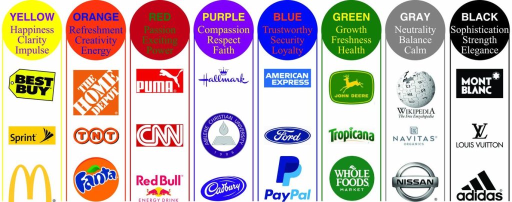
- Improve Recognition: Consistency in color usage can increase brand recognition. Think about iconic brands like Coca-Cola and their signature red, Nike with its unforgettable swoosh symbol, and MTN with its dominant use of yellow.
- Differentiate from Competitors: Careful color selection can help your startup stand out in a crowded market. It can also prevent confusion with competitors who use similar colors if you’re competing in the same category, especially with mature brands; you want to make a loud entrance by using colors that are not typical of your niche. Your brand bible should inform the colors that best reflect your value proposition. According to a large survey conducted by Xerox Corporation, 81% of customers believe that brand colors give businesses a competitive edge.
- Aid Retention: Memorable brands leverage the influence of visual cues in molding brand associations. If you’re a beer lover, you’ll probably equate the consumption of a bottle of Guinness with strength as its end value. Your reason could be influenced by the nutritional value information provided on the bottle or because, in color psychology, black signifies power. If you’ve followed Guinness’ brand messaging over the years, you’ll notice that the color of the Guinness brand is the forerunner of every campaign.
Similarly, MTN ‘s yellow and black color palette has a striking appeal. Yellow represents states of happiness and hope, manifesting in their commercials and how they relate directly with their target audience. When MTN says ‘Yello!,’ you know it’s definitely a happy hello. It cannot be forgotten because they have reinforced the color psychology in relation to their brand persona over the years. If you’re to establish a color palette for a brand, you need to first think of the kind of personality your brand should have before identifying colors that complement it.
The Psychology of Colour
Each color has a psychological association, making it essential to choose colors that resonate with your brand’s message and target audience. You may wonder how to pair up colors for your brand. Simply put, you’ll need to use your color theory and psychology knowledge to apply the best color scheme for your brand.
Source: stellar-signs.com
- Red
Keywords: Energetic, Passionate, Exciting
Red is an attention-grabbing color associated with energy and passion. It’s often used by brands aiming to create excitement and urgency.
- Blue
Keywords: Trustworthy, Calm, Professional
Blue conveys trust, reliability, and professionalism. Many tech companies, banks, and healthcare brands use blue to establish credibility.
- Yellow
Keywords: Optimistic, Cheerful, Friendly
Yellow radiates positivity and cheerfulness. Brands that want to appear approachable and friendly often incorporate yellow into their color palette.
- Green
Keywords: Fresh, Natural, Sustainable
Green is linked to nature and sustainability. It’s an ideal choice for eco-friendly and health-related startups.
- Purple
Keywords: Creative, Luxurious, Regal
Purple represents creativity and luxury. It appeals to artistic and high-end brands.
- Orange
Keywords: Energetic, Fun, Youthful
Orange exudes energy and playfulness, making it suitable for youth-oriented and creative brands.
- Pink
Keywords: Romantic, Feminine, Sweet
Pink evokes feelings of romance and sweetness, often chosen by brands targeting a female audience.
- Brown
Keywords: Reliable, Earthy, Vintage
Brown conveys reliability and earthiness, making it ideal for rustic and vintage-themed brands.
- Black
Keywords: Elegant, Powerful, Sleek
Black signifies sophistication and power, commonly used by luxury and premium brands.
- White
Keywords: Clean, Pure, Minimalistic
White represents cleanliness and simplicity. It’s favored by brands aiming for a minimalist aesthetic.

What Colours Attract People’s Attention?
A recent scientific discovery highlights ‘red’ as the most attractive color to men and women. Red is a striking color that attracts and sustains people’s attention more than any color; hence, it is popular in marketing communication. If you observe certain CTAs like SALE, SOLD OUT, LIMITED ITEMS, and DISCOUNT, they are always highlighted in red.
According to a survey by Hunjet Anica and Vuk Silvija, red is more effective for stimulating impulse purchases, as 90.7% of respondents believe colors affect their purchase decisions. E-commerce websites leverage this tactic to trigger more sales. HubSpot found that red converted more leads than green by 21%, aster A/B testing their CTA button color for conversion performance. Additionally, yellow and orange appeal to both men and women. Likewise, children are attracted to vibrant colors like yellow, blue, red, and green, and pink grabs their attention.
The Ultimate Rule for Combining Colors for Your Product:
- Your primary color should stimulate your desired experience for your target audience when they encounter your brand.
- Always leverage your knowledge of color theory and color psychology to select primary and complementary colors.
- Don’t be afraid to explore colors! Tweaking color tints and gradients can create that X factor for your brand.
- It is highly recommended that you use a maximum of three colors for your logo.
- Be attentive to various logo color schemes and how certain hues work seamlessly to create visually appealing and striking logo designs.
- Introduce balance to the color equation. Your colors should be combined at a ratio of 60%–30%–10%. The largest portion of your logo (60%) should go to the dominant hue, one-third of the composition should be occupied by the secondary color, and 10% percent goes to the color, which helps to make the accents.
Steps to Choosing a Color Palette for Your Business
Now that you understand the significance of color in branding, let’s explore the steps to choose the perfect color palette for your startup.
-
Define Your Brand Identity
Before diving into the world of colors, you must clearly understand your brand’s identity. Ask yourself these questions:
- What is your brand’s mission and vision?
- What are your core values?
- Who is your target audience?
- What is your brand’s personality? Is it fun, professional, eco-conscious, or something else?
Understanding these fundamental aspects will guide your color selection process.
-
Competitive Analysis
Keywords: Market Research, Competitor Analysis
Understanding your competitors and the industry landscape is vital. You should conduct market research and competitor analysis to identify:
- Which colors are commonly associated with your industry?
- What color palettes are your competitors using?
- Are there any gaps or opportunities in the color landscape that your startup can fill?
- This analysis will help you make informed decisions and stand out from the competition.
-
Mood Board Creation
Keywords: Mood Board, Inspiration
Create a mood board visually representing your brand’s identity and the emotions you want to evoke. Include images, colors, textures, and visuals that resonate with your brand. This serves as a visual reference during the color selection process.
-
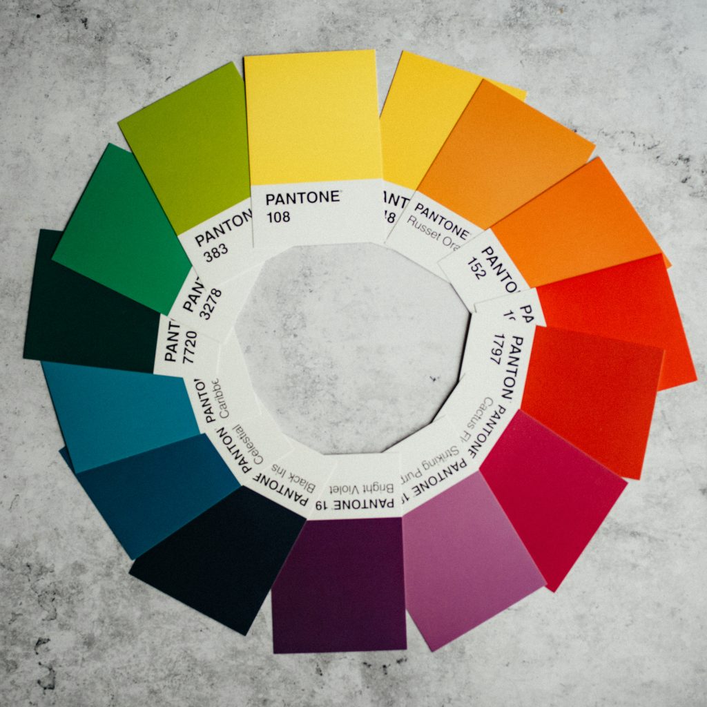
Color Wheel Exploration
Keywords: Color Wheel, Complementary Colors, Analogous Colors
Experiment with the color wheel to find complementary or analogous colors that harmonize well. The color wheel is a valuable tool that can guide your color choices. Here’s a brief overview:
- Complementary Colors: These are opposite each other on the color wheel, such as red and green or blue and orange. They create contrast and visual interest.
- Analogous Colors: These are adjacent to each other on the color wheel, such as blue, green, and teal. Analogous colors create a harmonious and calming effect.
Understanding how these color relationships work can help you create balanced, visually appealing color palettes.
-
Test Colors for Accessibility
Keywords: Color Blindness, Accessibility, Legibility
Ensure your chosen colors are accessible to all users, including those with color blindness. Some individuals may have difficulty distinguishing certain colors, so it’s essential to maintain good legibility and contrast.
Online tools and color blindness simulators can help you assess the accessibility of your color palette. Prioritize inclusivity in your design choices.
-
Gather Perceptions on the selected colors
Keywords: Focus Groups, Surveys
Conducting a pre-test on the color appeal of your brand is an effective way to set your business up for long-term success. Collect feedback from focus groups, surveys, or potential customers to gauge the emotional response your color palette evokes. People’s perceptions of colors can vary, so getting external input is valuable.
Consider asking questions like:
- What emotions or feelings do these colors evoke for you?
- Do these colors align with your expectations for a brand like ours?
This feedback can provide valuable insights and help you make informed adjustments.
-
Finalize Your Palette
Keywords: Finalize, Consistency
Once you’ve gathered insights and feedback, it’s time to finalize your brand’s color palette. Ensure consistency in your color choices, which will help build a strong and memorable brand identity.

-
Implementing Your Brand Color Palette
Now that you’ve chosen your brand color palette, it’s time to implement it across various aspects of your startup’s identity.
Incorporate your chosen colors into your logo design. Your logo is a cornerstone of your brand identity and should be instantly recognizable. Consider your logo Color Variations: create different versions of your logo with variations of your brand colors. Finally, you should customize your web and social media pages to bode seamlessly with your logo design and the overarching color palette.
Conclusion
At the start of your read, you may not have imagined a post on color scheme to be a long piece. But it’s worth it now that you’ve read it all! You have all the information in your arsenal to fire up your branding strategies through your color palette. Remember that your brand color palette is a vital component of your brand’s visual identity and plays a crucial role in shaping how your audience perceives the brand. It should be chosen thoughtfully and applied consistently across all brand touchpoints, from logos and websites to marketing materials and product packaging. Suppose you’re a new starter in the world of entrepreneurship. In that case, you should consider interacting with professionals in strategy and planning who can guide your processes and ensure that you’re properly set up for success.